Printing tiny text that stays readable comes down to one measurement: stroke width, the thinnest part of a letter. On a stock 0.4 mm nozzle that is about 0.8 mm, because a stroke has to be filled by two extrusion lines side by side. Size your letters around that number and the text survives; go below it and you get blobs.
The part that surprises people is that layer height barely matters here. Dropping from 0.2 mm to 0.08 mm layers smooths the top edge of a letter and can take hours off your print, but it does nothing for the flat detail that makes an A readable. Nozzle diameter is the only lever for XY crispness. Below is the reference table, then the workflow that gets you there.
Table of Contents
- Smallest readable text by nozzle diameter
- What You Need
- Step-by-Step
- How to Prepare the Text Model
- Set the Printer for Fine Detail
- Choose Materials and Printing Conditions
- Print, Remove, and Finish the Text
- Common Mistakes
- Frequently Asked Questions
- What is the smallest text size that can be printed in 3D?
- Is resin or FDM better for printing tiny, readable text?
- How do I keep tiny letters from filling in during printing?
- Should I print text raised or engraved for better readability?
- How can I make small 3D-printed text easier to read?
- Can I print text on a vertical or curved surface?
- Conclusion
Smallest readable text by nozzle diameter
These are the working minimums for capital letters in a bold, uncomplicated sans-serif. Anything smaller and letters start merging, counters fill in, and the word turns into a row of shapes.
| Nozzle diameter | Minimum capital height | Minimum stroke width | Usable layer height |
|---|---|---|---|
| 0.6 mm | 7-8 mm | 1.2 mm | 0.12-0.24 mm |
| 0.4 mm | 5 mm bold, 5-8 mm comfortable | 0.8 mm | 0.08-0.28 mm |
| 0.25 mm | 3.5 mm bold | 0.5 mm | 0.06-0.16 mm |
| 0.2 mm | 2.5-3 mm bold | 0.4 mm | 0.04-0.12 mm |
Roughly, the rule is twice the nozzle diameter for stroke width and around ten times the nozzle diameter for capital height. Switch to a 0.2 mm nozzle and every number in the 0.4 mm row halves.
What You Need
Four things have to be right at once: the printer’s ability to place narrow lines, the way the model is built, the material, and the finish. Fix any three and you still get unreadable text, which is why people spend a weekend chasing it.
- A printer that can draw a narrow line. A standard 0.4 mm FDM machine handles 5 mm bold capitals. Below that you want a 0.25 or 0.2 mm nozzle. Resin printers can go much smaller because the pixel grid, not a nozzle, sets the XY limit.
- Material. PLA for the sharpest surface and easiest cleanup. PETG for parts that take handling and heat. ABS or ASA if the piece lives somewhere warm. Resin if the text is genuinely tiny.
- A slicer with fine-feature controls. Bambu Studio, OrcaSlicer, PrusaSlicer and UltiMaker Cura all let you set external extrusion width, wall counts and detect thin walls. Cura’s older wall generator drops sub-nozzle walls unless you change it.
- Calibration basics. A flow or E-step check, a clean and level first layer, retraction tuned. Loose filament and inconsistent flow are what turn 0.8 mm strokes into 1.0 mm blobs.
- Post-processing supplies for contrast. Matte paint, a fine brush, and a filler such as paint, wax crayon or epoxy for engraved text.
Step-by-Step
How to Prepare the Text Model
Pick a font designed for small sizes before you pick a height. Serifs, hairlines and script joins are the three things that break first on a 0.4 mm nozzle.
Sans-serif bold faces hold up best. A community study on the Prusa forum printed and ranked swatches rather than reasoning about it, and landed on Osifont at 24 pt or Overpass at 16 pt as safe bets, with an absolute floor near 15.25 pt for Overpass. One user in that same thread got 5.2 mm tall numerals from Overpass Bold at 16 pt, two print lines wide, in PETG at 0.2 mm layers. Condensed display faces like Anton and Oswald look great on screen and fail below about 6 mm capital height, because the counters close up.
Getting the text into the model takes a minute in most tools. Tinkercad and Onshape have a shape generator with a text box. Fusion 360 has an Environment body with Text. In Blender, add a text object, extrude it, and convert to mesh. Bambu Studio and OrcaSlicer have a right-click Add Text tool for simple plates. PrusaSlicer can subtract text as a negative volume to cut engraving.
Set three values and stop: capital height, relief depth, and letter spacing. Relief depth for raised text sits between 0.6 and 1 mm; engraved cuts run 0.4 to 0.8 mm deep. As a rule of thumb, make relief at least three times your layer height, so at 0.2 mm layers you want 0.6 mm or more. Tighten the letter spacing only slightly, because extra side clearance costs you a little but breaks up stringing bridges between letters.
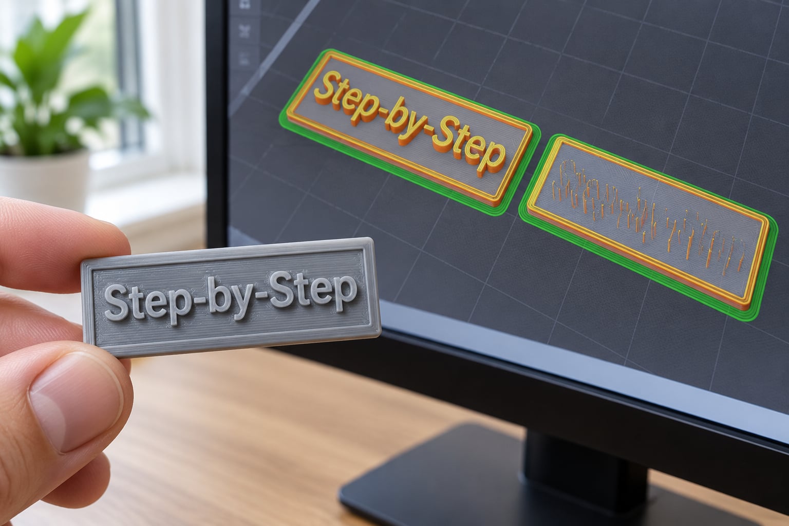
Then check the base geometry. Raised text needs a backing plate or a solid surface under it, and every letter needs solid contact with the part below rather than a hair of infill. Slice the model and flip to the layer view: if any letter floats as a separate island or a counter shows as an unprintable gap, thicken that stroke before you print.
Size to the distance the text will be read from. A keychain read in the hand wants 5 mm capitals. A desk plate read across a table wants 8 to 10 mm. A door sign read from two metres wants roughly 25 mm, because readable text scales with distance rather than with the size of the object it sits on.
Set the Printer for Fine Detail
Layer height controls Z resolution, and for flat text Z is almost irrelevant. It rounds the top edge of raised letters and nothing else. Fine layers still help in one way: a shallower layer puts a gentler step on the emboss, so use 0.08 to 0.12 mm when the text is proud of the surface and you care about the profile.
The control that does sharpen text is external extrusion width. A 0.4 mm nozzle lays down roughly 0.42 to 0.45 mm per line, and two of those make the 0.8 mm minimum stroke. Dropping external extrusion width to about 0.42 mm tightens corners on small letters without changing hardware, which is the first thing to try before buying anything.
Three more settings matter. Keep walls at 0.41 mm or more, since thinner walls get skipped. Turn on detect thin walls if your slicer offers it, so a single extrusion pass replaces the usual drop. And if your slicer has Arachne or an adaptive wall generator, it is worth testing on a text job because it handles small islands better, though it remains a debated default in the Prusa community.
For resin, the XY limit comes from the pixel pitch. Layer heights of 0.025 to 0.05 mm are normal, and text under 2 mm capitals is genuinely practical there. Resin cures and washes cleanly around raised lettering with no supports at all if the text sits flat on the build plate. Engraved text on resin still needs a slow print, around 25 mm/s, because the slot walls need time to settle.
Choose Materials and Printing Conditions
PLA gives the cleanest small detail and takes sanding and paint well. PETG strings a little more but holds dimension better, which matters when the text sits on a part that gets handled. ABS and ASA need an enclosure and a good bed adhesion because warping will lift the corner of a small label right where the first letters are.
The condition that changes the outcome most is cooling. Raised text needs each layer to set before the nozzle comes back around, so fan at 100 percent after the first few layers, and if your slicer supports it, set a minimum layer time around 6 to 8 seconds for the top surface. Slow the outer perimeters down too, since the corners of a small letter are where the plastic blobs if the nozzle is moving fast.
Do a coupon before the real job. A 50 by 50 mm plate with the same word at 4, 5, 6 and 8 mm capitals prints in about fifteen minutes and tells you more than an hour of theory. Print it in the material you plan to use, not in whatever is loaded.
Print, Remove, and Finish the Text
Watch the first three layers. If the letters are sitting on a thin first layer they will be weak at the base, and the fix is more squish and a small elephant’s foot compensation so the base does not bulge out past the letter edge.
Avoid supports wherever you can. Where you cannot, keep support points off the faces of the letters and off the inside of the counters, because supports fused into a cavity make that letter unreadable and force you to sand it back afterwards.
Remove the part cool, and break supports off by hand rather than with pliers against the lettering. Then clean the surface, fill engraved text with paint or a wax crayon, and sand raised text flat with fine grit if you want it flush.
Finish with a phone camera on macro mode, or a 10x loupe from the craft drawer. Look for open counters in the a, e and o, clean corners at the base of the A, and a gap you can see daylight through between adjacent letters. If any of those read as a solid mark, that stroke is too thin for your nozzle and no amount of cleanup will bring it back.
Common Mistakes
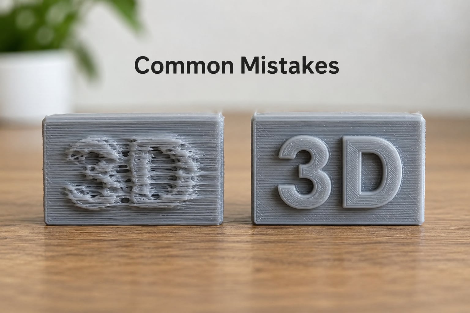
Most failures come back to one of four things: a stroke below the nozzle limit, excess flow, a weak first layer, or bad orientation. Work down the table.
| Symptom | Likely cause | Fix |
|---|---|---|
| Letters look like blobs, corners mushy | Strokes at or below nozzle diameter, or external extrusion width too wide | Set external extrusion width to 0.42 mm on a 0.4 mm nozzle, enlarge the font, or move to a 0.25 mm nozzle |
| Counters in a, e and o fill in | Condensed display font at small size | Switch to a normal-width sans-serif bold and raise capital height above 6 mm |
| Text vanishes in the slicer preview | Stroke thinner than one extrusion width | Thicken the text so every stroke spans two lines, or add a backing plate and make it raised |
| Strings of plastic between letters | Retraction and temperature, not the model | Re-run retraction calibration, raise nozzle temperature a few degrees, slow outer perimeters |
| Letters snap off the base | Weak first layer under a raised letter | More first-layer squish, elephant’s foot compensation, higher infill under the text area |
| Text mirrored on the finished part | Printed face down without checking the slice | View the part from the top in the slicer preview before slicing |
| Raised letters wobble under a fingernail | Relief depth too shallow for the layer height | Set relief to at least three times layer height |
| Cavity full of support plastic | Supports placed inside counters | Use tree or auto supports, or hand-cut a flat backing plate and print raised text |
One honest trade-off before you go finer: 0.08 mm layers take roughly 2.2 times as long as 0.20 mm layers. On a small plate that is the difference between 36 minutes and an hour and a half, and on a big one it is the difference between finishing tonight and finishing tomorrow. Fine layers do not buy sharper flat text, so spend that time on print time only when you are chasing the emboss profile.
The fastest way to avoid all of this is the coupon. Print one word at four heights, inspect it under magnification, and pick the smallest height that still reads. Do that before an eight-hour job, not during it.
Frequently Asked Questions
What is the smallest text size that can be printed in 3D?
On a 0.4 mm FDM nozzle, 5 mm bold capitals with strokes of 0.8 mm or wider is the practical floor, and 5-8 mm is comfortable. A 0.2 mm nozzle brings that down to roughly 2.5-3 mm capitals. Resin printers go lower still because pixel pitch sets the limit. Below these numbers counters close up and corners round off.
Is resin or FDM better for printing tiny, readable text?
Resin wins below about 3 mm capitals, where the pixel grid replaces the nozzle as the resolution limit and no supports are needed around flat text. FDM is easier, cheaper per part and fine for 5 mm and up. If your text is a serial number on a housing, FDM with a 0.25 mm nozzle will serve you better than the cleanup time resin costs.
How do I keep tiny letters from filling in during printing?
Give every stroke room for two extrusion lines, which means 0.8 mm on a 0.4 mm nozzle, and set external extrusion width near 0.42 mm so corners stay tight. Drop extrusion flow a few percent if edges bulge, slow the outer perimeters, and check the layer view first: if the slicer preview shows the counters merged, the print will too.
Should I print text raised or engraved for better readability?
Raised text reads better because nothing has to be excavated, and it needs a minimum capital height of about 5 mm with 0.6-1 mm of relief. Engraved text needs slightly larger letters, 6 mm or more, and 0.4-0.8 mm of depth, since narrow slots self-close during printing. Engraving does have one advantage: fill it with contrasting paint afterwards.
How can I make small 3D-printed text easier to read?
Contrast does more work than resolution. Print dark lettering on a light plate, add a second filament for the text alone, or mask and paint engraved letters once the print is clean. Add a raised rim around an engraved label so the eye finds the boundary, and size capitals to the reading distance rather than to the object.
Can I print text on a vertical or curved surface?
Yes, but flat the label area first. On a cylinder or sphere the surface curves away, so wall thickness changes around the letterform and the effective stroke width shifts with the angle. Cut a shallow flat pad where the text sits, then print raised lettering on it face down for the cleanest bottom edge. Engraved text on a curve is the case most likely to go wrong.
Conclusion
Start by making the text bigger or the relief deeper until every stroke clears twice your nozzle diameter. Then run a coupon plate with the same word at 4, 5, 6 and 8 mm capitals at a fine layer height, and read it under a loupe before committing.
Nozzle, model design, material and finish move together. Get the first one right and the rest stop fighting you.