To print text and embossed labels clearly, three levers decide the result: every stroke needs to be at least about 1.5 times your nozzle diameter, the label face needs to sit flat on the build plate in the XY plane, and the layer height needs to be fine enough to resolve the letter edges. Change any one of those and legible type turns into rounded-off blobs or vanishes from the slice entirely. This guide walks the whole chain, from turning a font into solid geometry to inspecting the finished part under angled light. It is aimed at desktop FDM and resin printers, not commercial UV and domed label machines.
Most mushy lettering is not a filament problem or a machine problem. It is a design and setup problem, and it shows up in the same three places on almost every printer I have seen it on. Get those right and the same model that failed on a fast, coarse print will come out crisp on the first try.
Updated for 2026. Tested on a 0.4 mm nozzle FDM machine and an MSLA printer with 50 micron pixels.
Table of Contents
- What You Need to Print Text and Embossed Labels Clearly
- Step-by-Step: How to Print Text and Embossed Labels Clearly
- Prepare the Text or Label Model
- Build a Stable Base for Embossed Letters
- Choose the Orientation and First Layer
- Set Layer Height, Walls, and Extrusion Width
- Set Resin Exposure and Orientation for Small Text
- Add Supports Without Covering the Letters
- Run a Small Test Print First
- Print, Cure, and Inspect the Result
- Choose the Right Text Treatment
- Common Mistakes When You Print Text and Embossed Labels Clearly
- Frequently Asked Questions
- What is the best embossing height for readable 3D-printed text?
- Should I print text as raised geometry or as a recessed engraving?
- Why are my embossed letters readable in the slicer but blurred after printing?
- How small can text be on an FDM or resin 3D print?
- Can I use the same model and slicing settings for FDM and resin printing?
- Conclusion
What You Need to Print Text and Embossed Labels Clearly
Before you touch a slicer you need five things lined up. Miss one and the print still runs, just with unreadable output.
- Source text or model. A font file you can load in CAD, a vector logo, or an existing STL of a label body you want to add lettering to.
- CAD or sculpting software. Fusion 360, FreeCAD with the Draft ShapeString tool, Blender, or a browser generator for a quick label. Fusion 360 is the most commonly recommended path because you type text directly with any installed font and extrude it outward for emboss or pocket it for engraving.
- A slicer. PrusaSlicer, Cura, OrcaSlicer or Bambu Studio for FDM. ChiTuBox, Lychee or another supported resin slicer for MSLA and DLP.
- Material matched to the detail. PLA and PETG hold a fine edge well and print cleanly at low layer heights. Resin holds the sharpest edges of anything on a desktop machine but is brittle at very thin features.
- Inspection tools. A loupe or a cheap USB microscope, a pair of tweezers and flush cutters for supports, an IPA bath and a UV cure lamp for resin, and a small angled desk lamp for the final check.
A note on scope before we go further: some of what ranks for this question is industrial UV and domed label printing, where raised letters come from liquid resin cured by UV light. That is a different machine class. Everything below applies to printers you can put on a desk.
Step-by-Step: How to Print Text and Embossed Labels Clearly
Prepare the Text or Label Model
Text has to become real geometry before a slicer can do anything sensible with it. In Fusion 360 you sketch the text, then use the Emboss command or an extrude to push it outward by the depth you want. In FreeCAD, Draft to ShapeString converts a font file into a shape you can extrude, and the same ShapeString can be reused directly as a pocket operation in Part Design when you want an engraving instead.
Blender users convert the text object to a mesh before exporting. In the browser generators, you pick a label shape from a gallery, type the text, and export an STL directly.
Four things to settle before exporting:
- Make it solid. Outline text converted straight to mesh gives you shells and holes. Run a solid or union operation, then export. A closed, manifold model saves trouble later.
- Check the reading direction. Flip the text in CAD so it reads correctly from the top of the plate when the label face is down. Reading it backwards in the slicer preview is the single most common beginner mistake.
- Enlarge small characters. Sub-5 mm capital letters with thin strokes need scaling up before printing. If it reads fine on screen at 100 percent zoom, it is probably too small for the printer.
- Set the emboss height for the machine, not a rule of thumb. On a 0.4 mm nozzle, 0.4 to 0.6 mm of relief is plenty. Resin handles 0.3 mm relief and thinner without trouble. Relief far above the nozzle diameter adds height without adding legibility.
Build a Stable Base for Embossed Letters
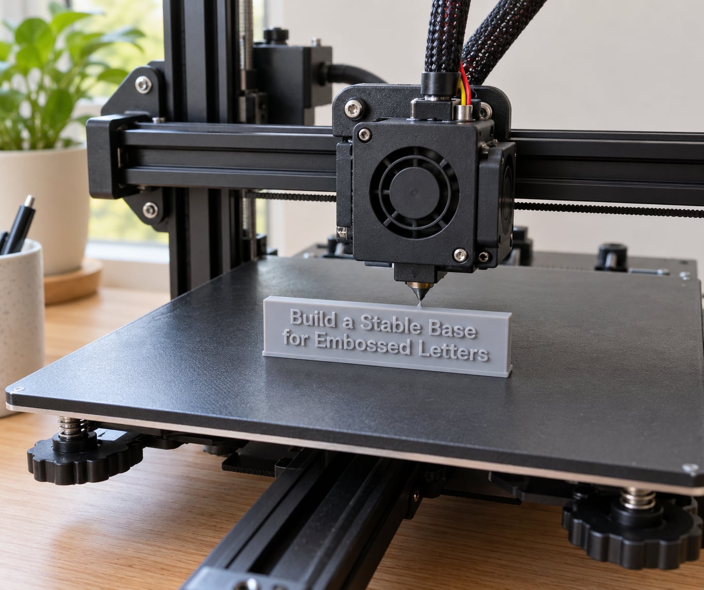
Raised letters need something to stand on. Connect each glyph to a thin backing plate so every character shares one solid footprint, and let the glyph overlap the plate by a fraction of a millimetre so the slicer sees a single body instead of separate islands.
Small standalone islands are the classic failure. They print on the first layer like they are fine, then curl or lift once the nozzle stops visiting them, and you get a letter lying on its side. A thin raft under the whole label, or a brim if the plate is dirty or the material is slippery, keeps those islands flat.
Rounded or bevelled letter edges catch light from more angles than sharp vertical walls, which helps legibility on a part you will hold in your hand. Go too far and the bevel eats the stroke width until the letter is weaker and less defined. A small chamfer is usually plenty.
Choose the Orientation and First Layer
Print the label face down, flat against the plate, so the letters build in the XY plane. Every layer is laid across the full face of the glyph and the stroke width gets printed accurately, because the nozzle only has to trace straight lines. Stand the label on its edge and the same letters have to be built out of thin Z steps that wobble, round off and often separate mid-print.
Three details in the same section:
- Text direction. Set the print direction so the seam lands on the back face, never across a letter. Seam correction in PrusaSlicer and OrcaSlicer is worth enabling for the same reason.
- First layer squish. Slight squish gives the glyph a solid base but also rounds the bottom edge of every letter. Too much squish turns a crisp vertical wall into a visible bevel. Ease off it if the letters look chamfered at the base.
- No islands, no curled edges. If the slicer preview shows a separate island inside a counter, such as the hole in an O or a letter that floats above the plate, fix the model rather than the settings.
Set Layer Height, Walls, and Extrusion Width
Layer height sets the vertical step on every letter edge. For FDM, a 0.1 to 0.12 mm layer height resolves glyph edges cleanly on a well-tuned machine. Going finer than your printer is calibrated for costs hours and usually gains nothing.
Starting values for crisp FDM lettering:
- Layer height of 0.1 to 0.12 mm, no more than 75 percent of your nozzle diameter.
- Three wall loops minimum, four or five if the letters are small and the surface must not show through.
- Extrusion width kept at or just under nozzle diameter, so the slicer can still fit a wall into a narrow gap between two strokes.
- Outer wall speed around 20 to 30 mm per second. Slower outer walls give the nozzle time to place the letter edges accurately.
- 40 to 60 percent infill. Detail comes from the walls, not the infill.
- Arachne or adaptive layer height disabled if you want every layer to be a consistent step.
The rule that governs all of it: the minimum feature width is about 1.5 times the nozzle diameter. On a 0.4 mm nozzle that is a 0.6 mm minimum stroke. On a 0.2 mm nozzle it is 0.3 mm. Anything below that and the stroke gets rounded off by the nozzle or dropped by the slicer entirely.
Set Resin Exposure and Orientation for Small Text
Resin gives you sharper edges than FDM because there is no nozzle width to respect. Your limits come from pixel size, layer thickness and exposure instead.
Run an exposure or calibration matrix for your resin and LCD rather than trusting a generic exposure time. Place the whole label face on the build plate, same as FDM, so the letters cure flat against the glass with all their edges in one plane. Bottom layer count of 8 to 12 gives a reliable base on the plate without fusing the first few millimetres of each glyph into one lump.
Anti-aliasing settings in the slicer smooth pixel edges, so a grey value of around 3 to 4 pixels is usually a good balance between crisp and smooth. Keep the light source parallel to the build plate, because a tilted LCD shades one side of every raised letter and softens the edge.
One warning: over-exposing resin makes edges brittle and leaves a wet-looking shine on the letter tops. If the embossing chips when you handle it, reduce exposure and exposure time before changing anything else.
Add Supports Without Covering the Letters
Most label plaques printed face down need no supports at all, because the letters are raised rather than recessed. You only need them for geometry that genuinely bridges, such as the underside of an arch or a model printed in the Z-plane orientation for a reason other than legibility.
When supports are unavoidable:
- Anchor them to the build plate through the label body, never through a visible letter face.
- Keep contact points off the top and sides of glyphs, where they leave scars and shadows.
- Use a low support density on a resin machine. Dense supports on 50-micron pixels fuse to the part and sand off skin during removal.
- Check the counters before printing. Enclosed areas in a letter such as A, B, D, O, P and R pool uncured resin on resin machines and hold support scars on FDM.
Run a Small Test Print First
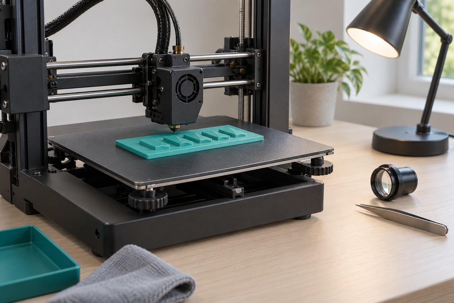
A test coupon takes fifteen minutes and saves a failed four-hour print. Make it a flat plaque a little larger than your palm containing the smallest capital letter you plan to use, a letter with a counter, some punctuation, and two or three different text sizes at the same emboss height.
The coupon should tell you four things at a glance: whether the smallest stroke survived, whether counters stayed open, whether the emboss height reads under angled light, and whether the first layer held the letters flat. Print it at the same layer height, nozzle size and wall count as the real part. A coupon at different settings tells you nothing.
Print, Cure, and Inspect the Result
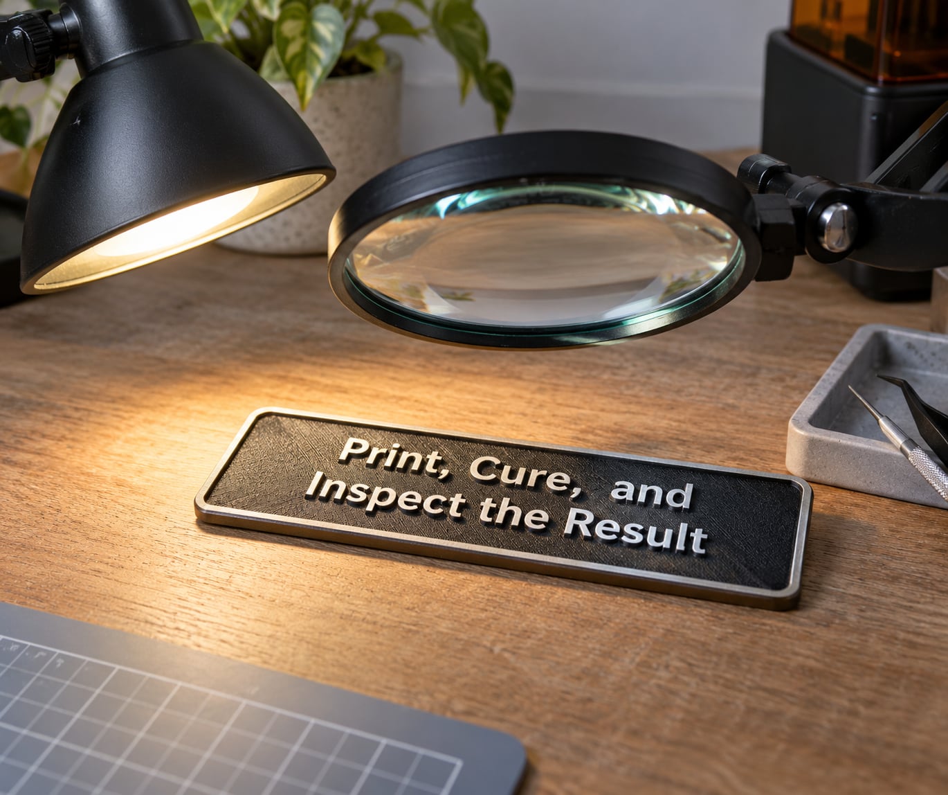
Watch the first three layers in the preview or camera. The glyph bottoms should be fused into the plate without visible gaps or lifted corners. If letters look correct there, they usually stay correct.
On FDM, remove supports with flush cutters rather than forcing them sideways, then knock the layer lines down with 180 to 400 grit paper over the faces. A thin filler primer and a matte paint take care of the rest and make light letters far more readable under a lamp.
On resin, wash off the uncured resin, cure the part fully on all sides including the letter tops, then remove supports with a sharp scalpel held flat against the surface. Cure time that is too short leaves the letter faces tacky and smudges the definition.
Finish with angled light. Hold the part under a desk lamp at about 45 degrees and look at each letter from the side. Edge definition shows up far better at that angle than head-on, and a loupe on the smallest stroke tells you whether you are one layer height away from clean or ten.
Choose the Right Text Treatment
Embossed text is not the only option, and for some parts it is the wrong one. Here is how the main treatments compare.
| Treatment | What it is | Strength | Weakness | Best use |
|---|---|---|---|---|
| Embossed | Text raised above the surface | Reads under raking light, survives handling, no post-processing | Adds thin features a coarse nozzle cannot resolve | Nameplates, panel labels, branding plates |
| Debossed | Text pressed into the surface | No raised edges to knock off, less visible in profile | Can trap dirt, holds light and needs contrast paint | Flat plaques where a low profile matters |
| Inset | Recess filled with a second material or colour | Highest contrast, easiest to read at a distance | Needs a multi-material or manual fill step | Control panels, keycap legends, asset tags |
| Two-material | Body and text printed in place from two filaments | Sharp colour break, no paint needed | Purge and interface tuning, limited to compatible filament pairs | High-contrast signs and labels in one print |
The same model file gives you any of these by changing one operation in CAD. Emboss pushes outward, pocket pushes inward, and inset is a pocket sized to the second material.
Common Mistakes When You Print Text and Embossed Labels Clearly
Nearly every legible-text complaint falls into one of the patterns below. Find the symptom, change the single cause, and print a coupon before you go back to the real part.
| Symptom | Likely cause | Fix |
|---|---|---|
| Letters blurry or fused together | Stroke width under about 1.5x nozzle diameter | Scale the text up or use a smaller nozzle |
| Letter tops missing | Emboss height too shallow for the layer height, or the glyph merged into a single top skin | Raise relief to at least two layer heights |
| Text disappears after slicing | Features below minimum size, often a counter or hairline gap the slicer cannot resolve | Thicken strokes, then check the preview again |
| Rough or stringy letters | Retraction too low for the travel distance, or damp filament | Run a retraction test, dry the filament |
| Letters falling over | Small islands on the first layer with no raft or brim | Add a raft or brim, or merge glyphs into the plate |
| Support scars across a letter face | Support contact points placed on visible glyph surfaces | Move anchor points to the back face, lower density |
| Layer shifts partway through | Raised letters act like a cooling fin and tug on a fast outer wall | Lower outer wall speed, add a brim or draft shield |
| Brittle, shiny resin letters | Over-exposure | Run the exposure matrix, drop exposure time by 0.5 s steps |
| Weak embossing that snaps off | Relief taller than the plate thickness, or too few wall loops under the letters | Thicken the plate, add wall loops under the glyph |
| Bad first layer under the letters | Z offset too low and elephant-foot rounding the glyph base | Raise the nozzle slightly, lower first layer squish |
Change one thing at a time. Adjusting layer height, speed, flow and temperature together tells you nothing about which one mattered, and you will usually revert the good changes along with the bad.
Before you commit a print, run through this list:
- Smallest stroke is at least 1.5 times nozzle diameter, and the smallest counter is open in the preview.
- Label face is flat on the plate in the XY plane, and the text reads the right way round in the preview.
- No isolated islands anywhere under the glyphs.
- Layer height at or below 0.12 mm on FDM, or a calibrated exposure matrix on resin.
- At least three wall loops and an outer wall speed of 20 to 30 mm per second.
- Seam set on the back face, away from any letter.
- Supports anchored through the body, not touching a visible glyph face.
- A coupon at the real settings already proved the smallest letter reads.
Frequently Asked Questions
What is the best embossing height for readable 3D-printed text?
On a 0.4 mm nozzle, 0.4 to 0.6 mm of relief is the useful range. Anything under two full layer heights disappears into the top surface, and anything past about 1 mm adds height without improving legibility. Resin printers handle 0.3 mm relief cleanly. The real readability comes from stroke width and layer height, not from how tall the letters stand.
Should I print text as raised geometry or as a recessed engraving?
Raised text prints and reads better on most desktop printers, because you are adding material rather than asking a nozzle to fit into a narrow recess. Recessed text is easier to keep flat and never knocks off, but it collects dust and needs paint or a fill to gain contrast. Choose engraved text when the part must stay thin or the lettering will be handled a lot.
Why are my embossed letters readable in the slicer but blurred after printing?
The slicer only knows ideal geometry. Once printing, the nozzle rounds any stroke narrower than about 1.5 times its diameter, and a layer height above 0.12 mm steps each letter edge. Check the smallest stroke in your model first. If it is wider than 0.6 mm on a 0.4 mm nozzle and still blurs, lower the layer height and the outer wall speed before changing anything else.
How small can text be on an FDM or resin 3D print?
On a 0.4 mm nozzle, treat 0.6 mm as the practical minimum stroke width, which puts reliable capital letters around 5 to 6 mm tall. A 0.2 mm nozzle drops that to roughly 0.3 mm strokes and 3 mm letters. MSLA resin with 50-micron pixels resolves smaller still, around 2 to 3 mm capitals. Braille domes need a sharp resin print or very fine FDM to stay legible.
Can I use the same model and slicing settings for FDM and resin printing?
The STL transfers directly, since both machines read the same mesh. The settings do not. FDM is limited by nozzle diameter, so layer height, wall loops and extrusion width all matter. Resin is limited by pixel size and exposure, so you set layer thickness, bottom layer count and exposure time instead. Design the model so the smallest stroke clears both limits and one file serves both machines.
Conclusion
Legible lettering comes down to a short chain, and every link is checkable before you print. Keep every stroke above 1.5 times the nozzle diameter, put the label face flat on the plate, drop the layer height, keep the seam off the letters and inspect under angled light. Start with a flat calibration plaque carrying the smallest letter and the lowest relief height you plan to use. Print that first, and the full label becomes a boring print instead of a gamble.